Worldometer.info
The worldometer.info site publishes general statistics about world populations (births,deaths, net growth), Government (healthcare, educations, military expenses), Economics ( Cars, Bicycles, computers produced), Society and Media and more.
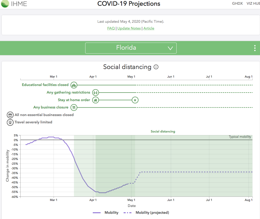
May 8, 2020: There has been a major update to Worldometeres.info for the USA information that was implemented May 4th. They have added projections for each state. For some states they now have county level data.

When you click on”projections” on the far right of the table. The site opens a page that shows the follow charts:
- A timeline of when different social distancing rules went into effect and were ended.
- A timeline of actual and projected
- Mobility
- Infections and testing
- Deaths per Day
- Total Deaths.
- Hospital Resources Use
For the projection they show the range of possible outcomes given the variable in the model. The mobility actuals and estimates are based on cell phone tracking data. I reviewed the charts for a few states. New York Hospital Resources Use show how bad it got there. The testing projection shows that the amount of testing is still increasing rapidly – it’s still much lower than other countries when tests per one million people are compared. To get more information on the changes that occurred on May 4th you can click on “Update Notes” at the tope of the state report.
Here’s a sample of part of the reports per state. Check out these new reports at https://www.worldometers.info/coronavirus/country/us/

Original Review Mar 18, 2020
For Coronavirus (COVID-19) worldometer.info (Their URL is https://www.worldometers.info/coronavirus/) reports statistics for the entire world. You can drill down by country and within the USA, drill down by state. The report can be sorted by;
-
-
- Total cases, new cases and cases per one million population (Which is the only way to really compare different countries and states).
- Active cases
- Total recovered
- Current serious/critical cases
- Total deaths, new deaths and deaths per one million
- Total Tests, and tests per one million
-
For the main chart each update is listed by source at the bottom of the page. They also provide the ability to go back to previous days and view the references for that day. The site also reports which states are including probable deaths in their statistics (Currently New York, Maryland Wyoming).
The site produces time scaled xy graphs for the following trends for the world, each country and – for the United States – each state.
-
-
- Total Coronavirus Cases
- Daily New Cases
- Active Cases
- Total Coronavirus Deaths
-
April 30th Notes; For the United States The total number of cases is now growing in a linear manner. The growth is not accelerating – which is good. But 25,000 to 30,000 new cases a day is not anything to be happy about. Deaths are also now growing in a linear manner. The growth is not accelerating – which is good. But an average of 2,000 deaths a day is also not a good thing.
The site also has information on;
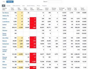
Here’s a screenshot of the main chart taken on April 21, 2020 looking back on April 20, 2020.


Pingback:World Health Organization – Michael William Hughes
Pingback:COVID-19 Information – Michael William Hughes