LA Times COVID-19 Page
The LA Times has a COVID-19 page that has significant detail of California data, with more detail on LA county and the surrounding areas. For California, it has tables of;
- Cumulative Cases
- New cases per day
- Deaths per day
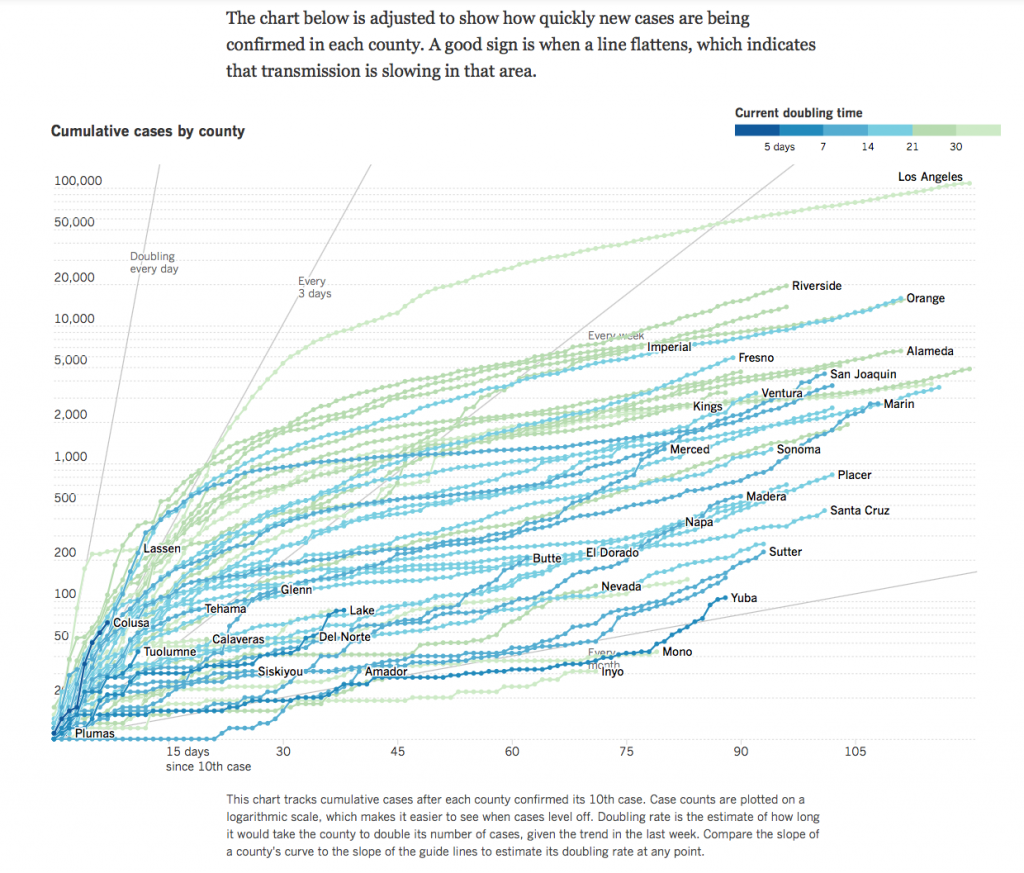
- Comparison of counties over time (See sample chart below)
- A heat map of Cases and Deaths per California county.
- New cases and New Deaths overtime per county since March 1
- A bubble heat map showing confirmed cases per city
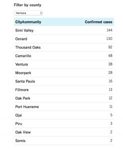
- You can filter a list of cities by California county to see the confirmed cases per city with a county. I posted the data for Ventura for May 1 on this page
- A temperature map showing how California compares to other states
- Number of people hospitalized by intensive case and other hospitalized patients
- A list of Nursing homes affected (The list is sadly long)
- A Graph of Cumulative tests conducted with a graph showing pending vs completed tests
- Data on the demographics of who has COVID-19
- A graph of Health Care workers with confirmed cases by county over time
- The restrictions per county
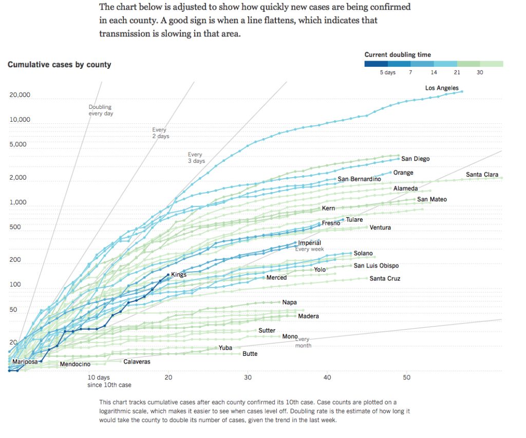
The most interesting chart is the comparison of countries cumulative. The chart of April 25th showed that most countries were leveling off except for LA County and Kings County. Looking at the data for May 1, 2020. Kings County is now doubling its cases every 4.2 days. LA has dropped to a doubling of cases every 16.9 days.
July 4, 2020 update
Things have gone seriously wrong. Nursing homes have accounted for about 50% of the deaths from COVID-19. Los Angeles has got it doubling rate down to every 32 days, but a lot of other counties are seeing rates from 6 to 16 days. Ventura is every 14.8 days. Some – like Colusa county – have a doubling rate of 3.2 days. Deaths per day have not gone down.

The site is at URL https://www.latimes.com/projects/california-coronavirus-cases-tracking-outbreak/
Here’s the view on April 25th.


Pingback:COVID-19 Information – Michael William Hughes